When I first evaluated the various mirrorless systems, I considered as a plus the availability of Carl Zeiss glass, because of their high reputation. In particular I was interested in the Sony Zeiss Vario-Tessar T* E 16-70mm F4 ZA OSS (SEL1670Z) as its range is my favourite one for landscapes. So the SEL1670Z was the first in my buy list, after the initial evaluation of the NEX-6.
But then a number of reviews [1, 2] came with so-so evaluations of Sony glass and in particular this lens, mentioning a higher-than-expected softness in the borders and possible decentering defects, something you don't accept for a lens whose price is around 1.000€. Things in the Web must be taken with many pinches of salt, but some of the full-size samples in those reviews were clearly showing some mushy borders. For these reasons I postponed the buy, starting instead with the Sony E 10-18mm F4 OSS. While all in all it's a good performer, apparently better than my Nikkor 12-24mm ƒ/4G DX AF-S, it seems to show a decentering defect too (also detected at Photozone.de), confirming some possible issues with Sony quality control. In fact, I don't think that the problem is with the lens design; at least for what concerns the SEL1670Z, not all the published full-size images show the problem (some indeed look not bad at all [1, 2, 3]); a possible confirmation of the hypothesis of a certain variability of copies.

The Sony Zeiss Vario-Tessar T* E 16-70mm F4 ZA OSS mounted on a NEX-6
Just before Christmas a special offer (150€ discount) at Amazon pushed me to try the thing by myself, also considering that I'm allowed to return it in a few days just because I didn't like it. I first ran an in-house test against test targets derived from an ISO12233 chart, comparing a the perfomance with the Nikkor 18-70mm ƒ/3.5-4.5G ED DX AF-S. While I don't have the proper equipment to ensure a perfect alignment and I need to improve the procedure (that's why I'm not publishing the results yet), considering that if I made some error it's very likely that I did it for both lenses, the Sony Zeiss looks as a clear better performer than the Nikkor (as it should be: there's a 4x difference in price).
But a lab test is not enough (just to say one reason, because it involves focusing only at short distances), so I also tried some landscape shots near home. In this session, with a few exceptions, I never used either a tripod or a monopod, I only relied on lens stabilisation; all tests were shot at ƒ/8, which according to some reviews is the sweet spot of the Sony Zeiss lens, and “exposed to the right”. All subjects were shot in a burst with refocusing disabled, and the best (sharpest) shot was later manually picked.
Photos were post-processed in Lightroom 5 as per my usual workflow, applying lens geometric correction, chromatic aberration compensation and sharpening (amount 60 / radius 1 / detail 60). Note that this is different than most other tests around, but in the end it's the final result that interests me. Be aware that geometric correction might throw a few pixels out of the border, but just a few; I didn't apply any perspective correction.
Move the mouse over the photos below for activating a 1:1 magnifying loupe (the full size images are JPEG compressed at 100%, whose size ranges between 11MP and 16MP, so be patient for the download!). Also clicking on the underlined links in the comments below will activate the loupe over the related portion of the photo.
Testing for sharpness
The most important thing I looked at in this session was the sharpness, with particular attention to borders.
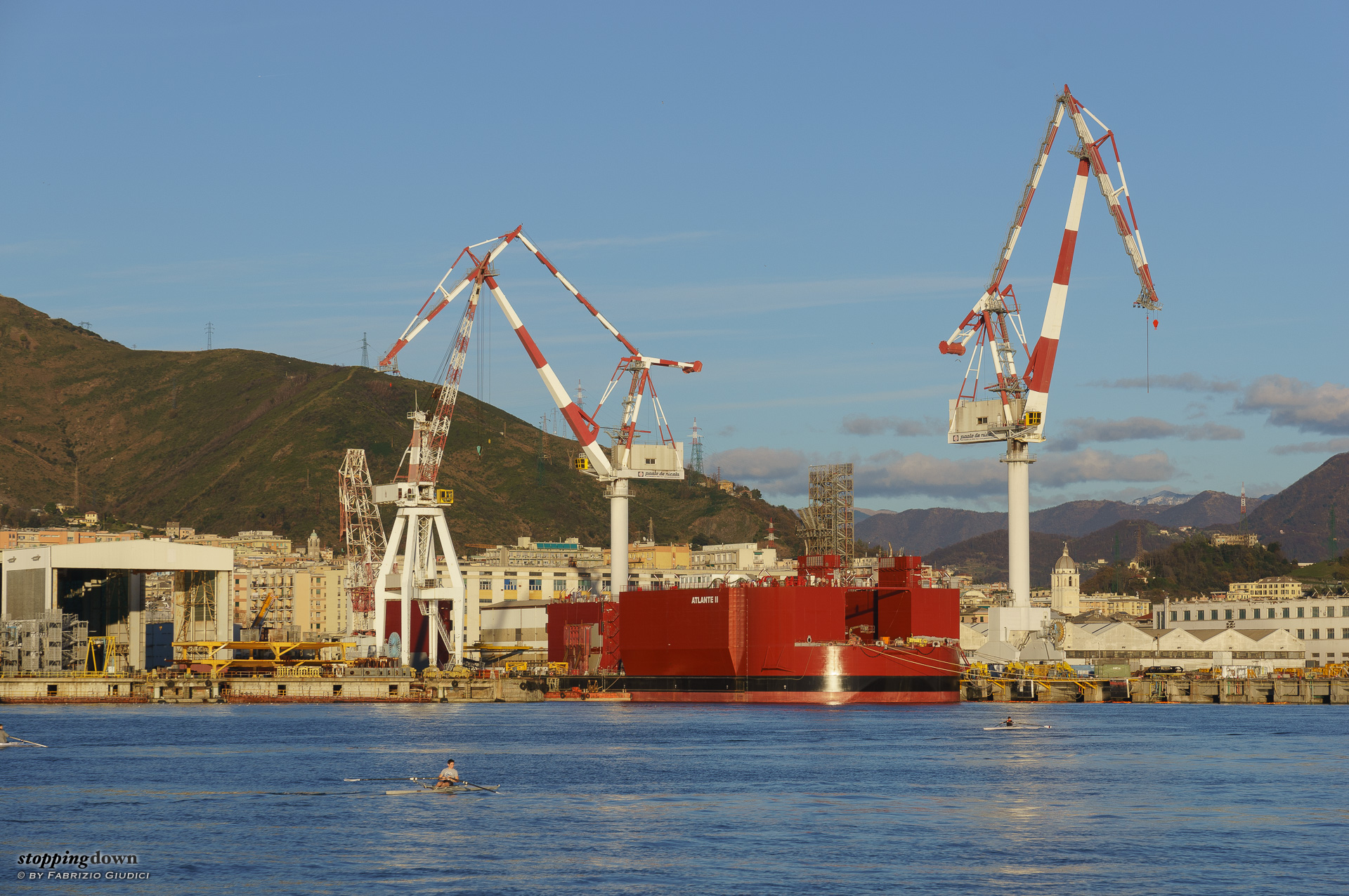
Sony NEX-6 + Sony Zeiss Vario-Tessar T* E 16-70mm F4 ZA OSS @ 68 mm, 1/200 sec @ ƒ/8, ISO 100
Gru a Sestri Ponente.
Good details at the centre, look for instance the electric cables over the hill in the background. The right border seems ok (look for instance at the three windows grilles just above the yellow stuff), while the left border looks mushy (look at the yellow railing) — note that it's not a DoF problem as things in the same plane, just a bit towards the centre, are ok.
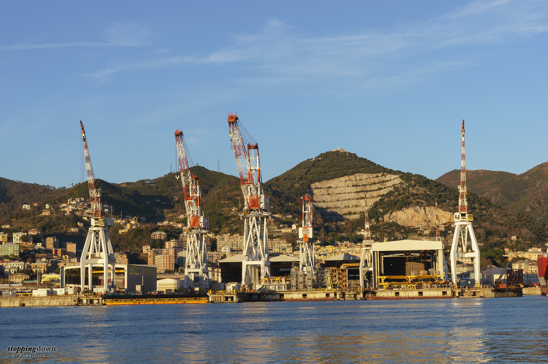
Sony NEX-6 + Sony Zeiss Vario-Tessar T* E 16-70mm F4 ZA OSS @ 41 mm, 1/100 sec @ ƒ/8, ISO 100
Gru a Sestri Ponente.
This image is purportedly tilted. Good details at the centre, look again at the electric cables over the hill in the background. The left border looks good too (e.g. the building windows) while the right one is worse (look again at the windows).
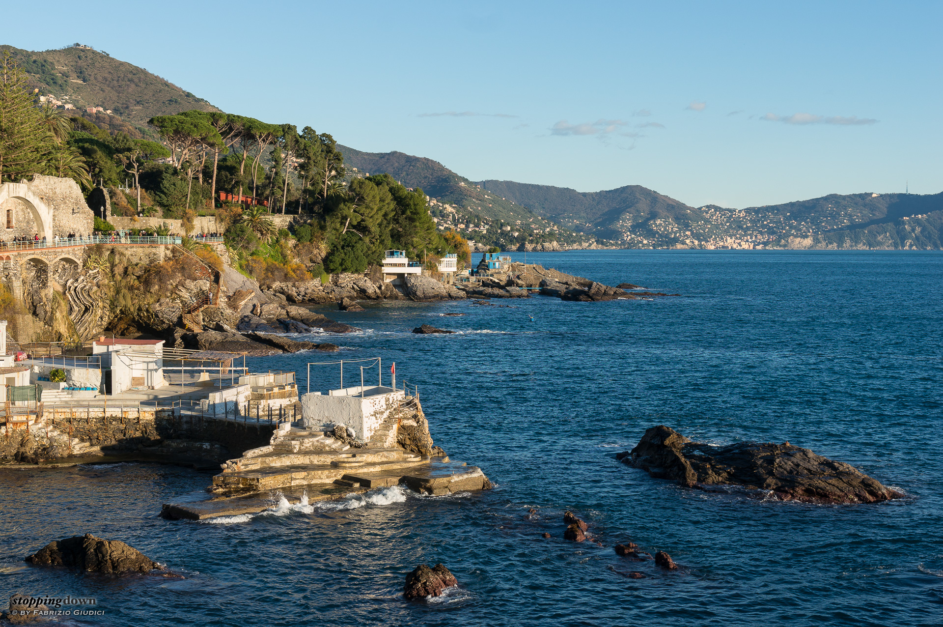
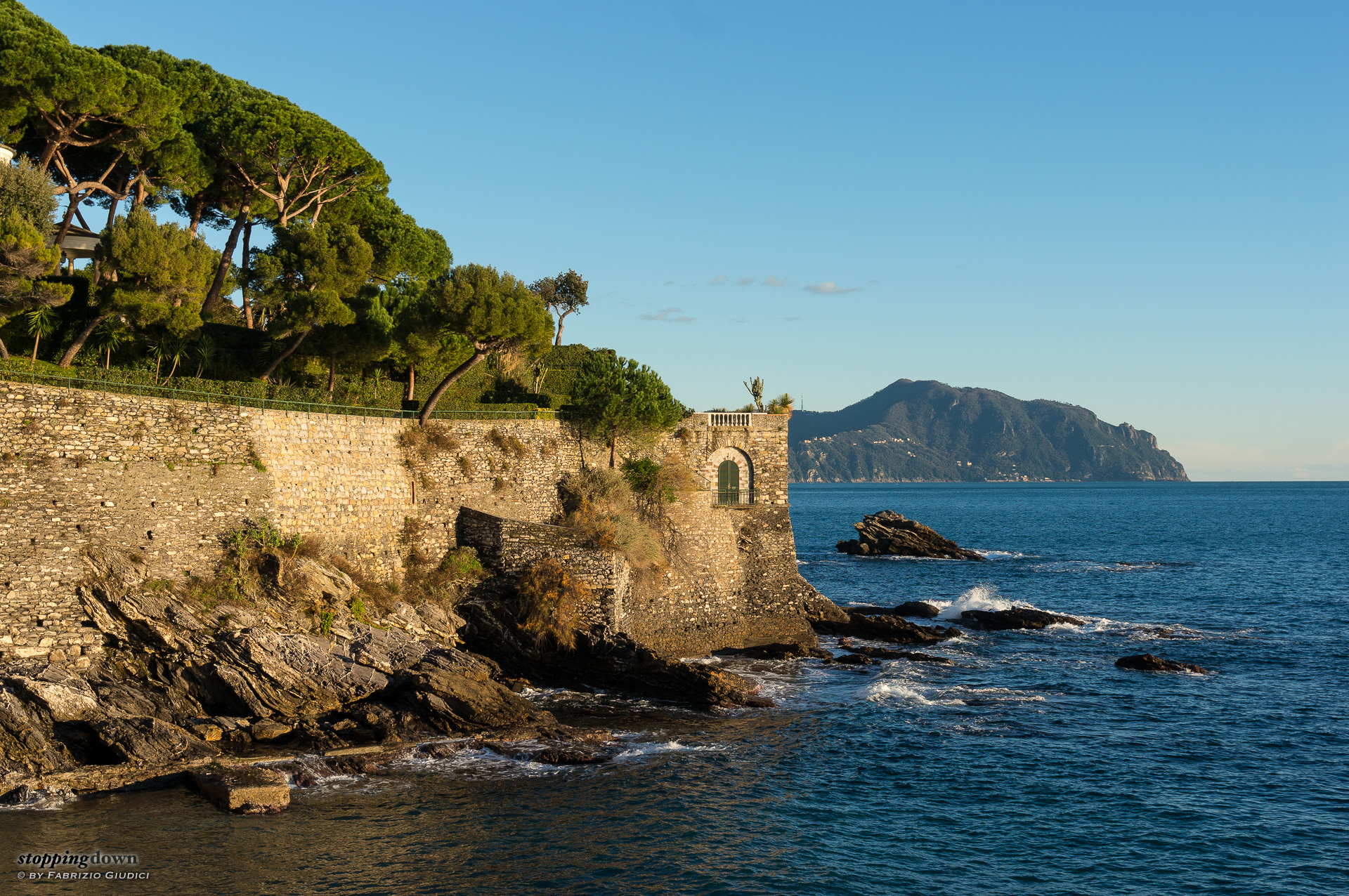
Sony NEX-6 + Sony Zeiss Vario-Tessar T* E 16-70mm F4 ZA OSS @ 35 mm, 1/100 sec @ ƒ/8, ISO 100
Genova Nervi.
The left border sharpness seems ok, look for instance at the branches, the walkway railing and the grille of the window. It's a bit harder to evaluate the right border, as there are just a few things, but the rock looks substantially of the same quality as the rock at the left. There are also good details in the background.
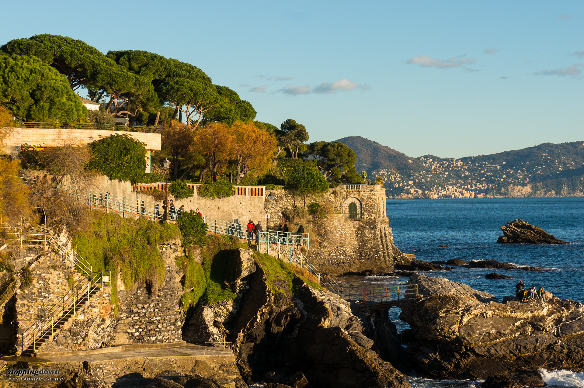
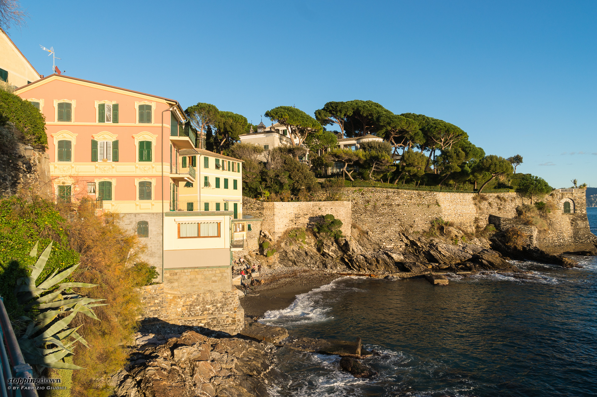
Sony NEX-6 + Sony Zeiss Vario-Tessar T* E 16-70mm F4 ZA OSS @ 55 mm, 1/100 sec @ ƒ/8, ISO 100
La passeggiata Anita Garibaldi a Genova Nervi.
The centre is sharp, the left border is ok, as well as the right border (but none of them is exceptionally good).
Sony NEX-6 + Sony Zeiss Vario-Tessar T* E 16-70mm F4 ZA OSS @ 30 mm, 1/80 sec @ ƒ/8, ISO 100
Portofino visto da Capolungo.
The centre is sharp, the left border is ok.
Sony NEX-6 + Sony Zeiss Vario-Tessar T* E 16-70mm F4 ZA OSS @ 16 mm, 1/80 sec @ ƒ/8, ISO 100
Capolungo.
The centre is sharp, the left border is ok (again not exceptionally good, but I think this is acceptable for 16mm), while the right border looks softer.
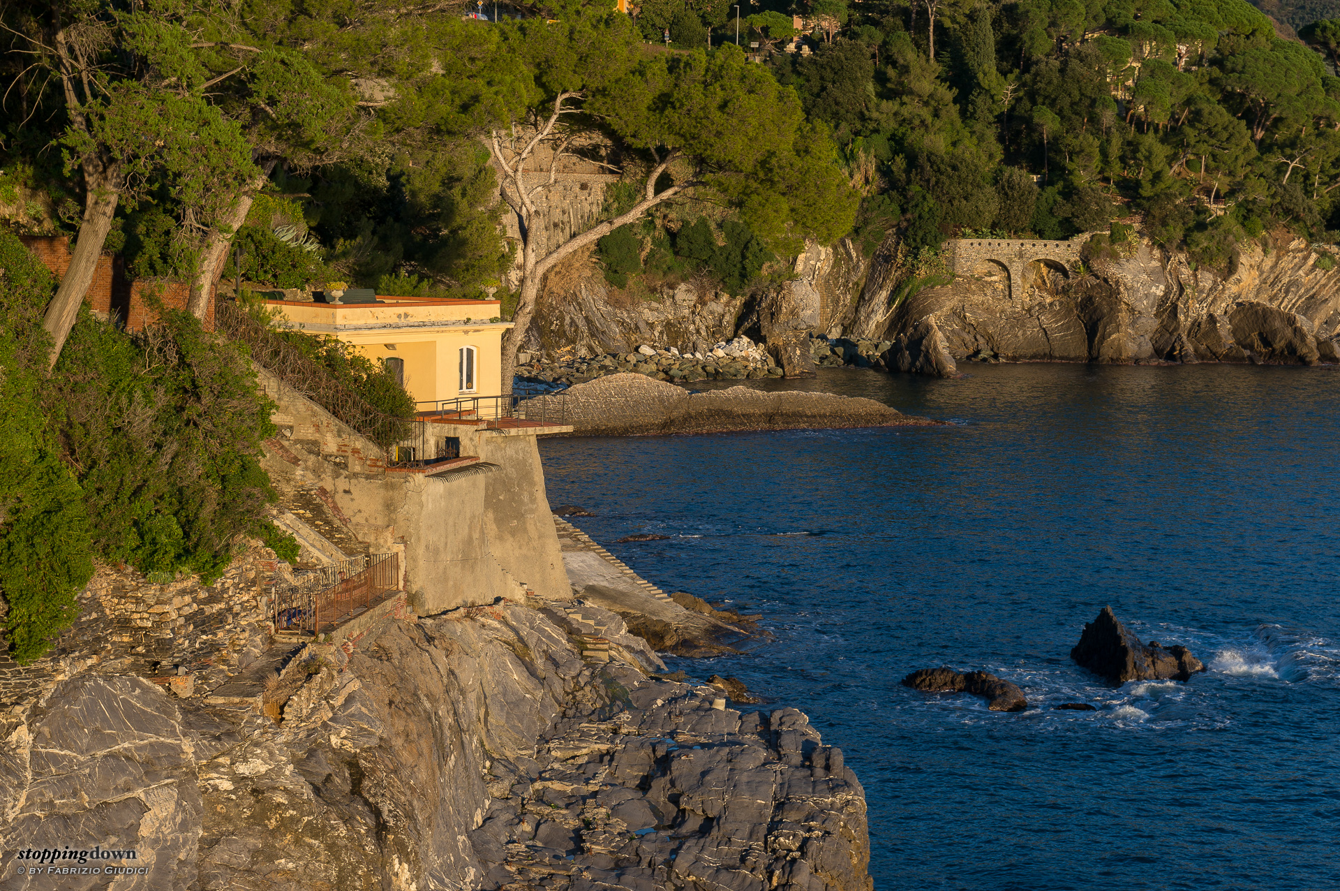
Sony NEX-6 + Sony Zeiss Vario-Tessar T* E 16-70mm F4 ZA OSS @ 41 mm, 1/60 sec @ ƒ/8, ISO 100
Verso Bogliasco.
The left border seems ok, look for instance at the small piece of the brick wall. The right border, instead, looks soft.
Those photos were too few to make a meaningful statistic, but trying to sum up the results so far, in function of the focal length, we get:
| focal | left border | right border |
| 16mm | ok | slightly softer |
| 30mm | ok | - |
| 35mm | ok | probably ok |
| 41mm | ok | softer |
| 41mm | ok | softer |
| 55mm | ok, soft | ok, soft |
| 68mm | softer | ok |
One possibility is that the lens is slightly decentered, with the softness passing from the right border at shorter focals to the left border for longer ones (but the photo @35mm is an exception). Another possibility is that the culprit is the lens stabilisation, making the problem intermittent. In at least one case, in fact, I've seen a photo in a burst where the left border was visibly worse than other photos in the same burst, being the centre and the right border equally sharp.
The border behaviour of this lens is still puzzling me. It's to be said that the amount of border softness in my copy, at least for the few photos so far, is not that relevant (even though we're talking of photos sharpened in post-processing) — I can't say a final word, also considering that price raises the expectation bar.
Other features
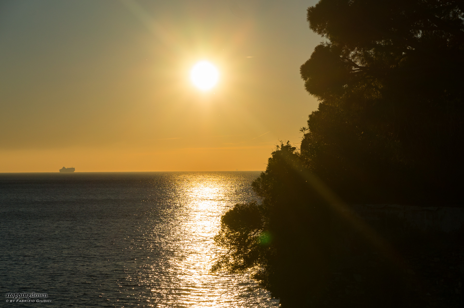
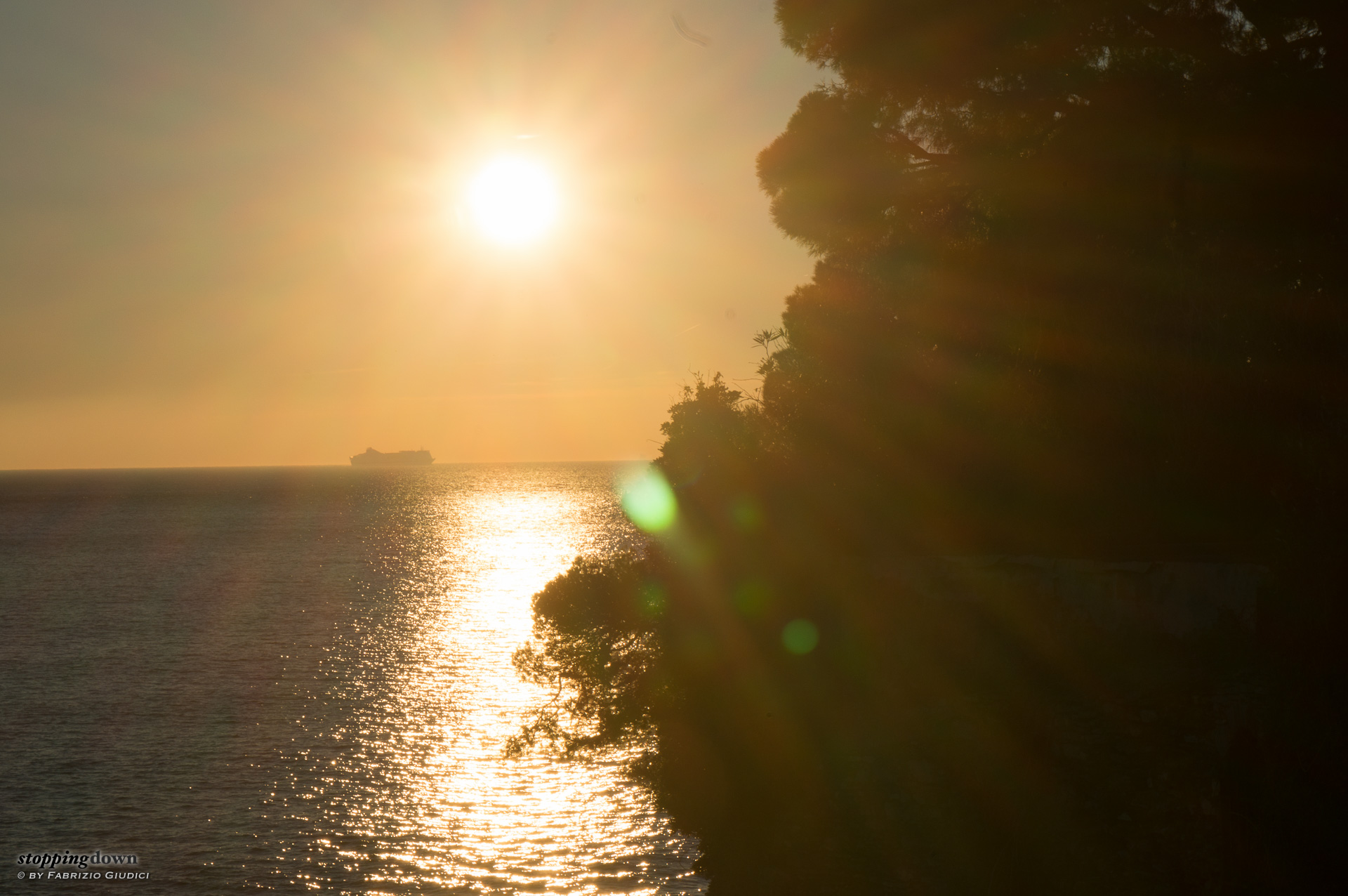
Shooting with the sun in the scene seems to give inconsistent results. For instance, at ƒ/8 you can arrange things so there's a moderate amount of green blobs, that can be eventually fixed in post-processing. It's a bit hard to do because of the stabilisation, so in the viewfinder they keep on moving, appearing and disappearing and changing size (probably it's better to turn stabilisation off for this kind of shot). Unfortunately, there's also a long diagonal streak that seems to be unavoidable. Here I didn't expose to the right, of course.
Shooting with the sun in the scene at ƒ/22 — something that is usually done to create sun rays — produces so many green blobs that are impossible to control, plus a big bunch of streaks that strongly reduce the contrast. In a word, the lens is unusable in this situation.
