One of the things that most casual photographers don't get is colour management. What's the matter? Well, if you are the only person looking at your photos — or, better, your photos are only shown through a single appliance — and you don't look at others' photos, there's no issue. If you use multiple devices, publish your photos to the web, send them to a print lab or look at others' works, you have a problem. The fact is that the culture behind home computers and TV appliances has spread the false notion that a colour on a display can be described as a simple triplet of numbers, the famous RGB values. This is only partially true: yes, displays render colours by means of those three values, but a given RGB triplet won't render the same colour in two different displays, or a display and a print. First, for displays, rendered colours depend also on the settings of the device (e.g. brightness, contrast, saturation, etc...), but above all different models are capable of rendering different ranges of colours (technically called gamut). This means that if you don't consider colour management, that fantastic RGB value that renders the garden grass so good on your monitor will appear different in every other display. Not to mention your printing lab: if you don't cope with colour management in the proper fashion, there's no way to get your prints without an annoying colour cast. The problem, indeed, started even at a prior step, since even the RGB values in a digital photo file are relative to the camera capabilities, so perhaps you're blaming your camera for producing poor colours, while it's your monitor. Sure, you can post-process your photo with an editing software until it looks good on your display, but other people will see the results of your editing in a different way.

There is a number of excellent technical introductions to colour calibration and the science behind it. Here I'd only like to give a fundamental recap for practical purposes.
Where do colours come from
First, colour is related to light, which is electromagnetic radiation, whose main property is the frequency (or the related wavelength). The so-called rainbow colours are the range of all the kinds of visible light which is monochromatic, that is composed by a single radiation with a given frequency. In practice, pure monochromatic colours seldom occur (basically, only in laser emitters), while an everyday colour is made by a mixture of different frequencies and a physicist would describe it with a spectrum, a diagram that tells us the relative distribution of different light frequencies in a given measurement.
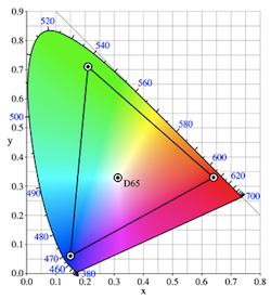
But we're talking about photos, thus how a human being perceives things. Perception is related to physics, but by means of an indirection layer. It happens that our eyes are composed by three kinds of receptor cells, that are sensible to three different wavelengths (roughly red, green and blue). This means that if we want to describe a perceived colour in a unique and unambiguous way we must use values representing the stimuli of the receptor cells. Ignoring the slight differences of perception among individuals (and pathologies too), experts have defined a standard set of coordinates to represent those stimuli: the CIE 1931 XYZ space (for practical purposes experts have defined also alternate perceptual spaces which are equivalent, but for simplicity we can just refer to XYZ).
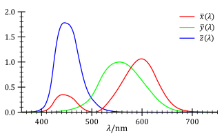

The responses to wavelength of human eye receptors (as defined by the CIE standard observer) and the CIE 1931 xyY colour space (seen in two dimensions), a close relative of the XYZ colour space. The coloured area is known as the “chromaticity diagram”: everything inside it is a perceivable colour (courtesy of Wikimedia Commons).
There's white and white
There's a further point to deal with, the notion of white. White colour is defined as the brightest possible light perception and for human beings living on the Earth the natural brightest light source is the sun. So, perceptually talking, the sun is white (beware that an astronomer classifies it in a different way) and it's extremely stable. It apparently changes colour through the day because of the relative position to the atmosphere, with the brightest light occurring around noon. From a physical point of view, the sun emits light because it's hot, and physics relates that kind of thermal light emission to the surface temperature. That's why white quality is referred as colour temperature and is measured in Kelvin degrees, usually between 5000K and 6500K. Lower temperatures are called “warm” or “reddish” whites, upper temperatures are called “cool” or “bluish” whites (note that warm and cool are referred in the opposite way as in our general culture that associates blue with ice or fresh water).
Things are not so easy, though, because the human vision is capable of chromatic adaptation: it's more a brain than eye thing and it involves identifying objects. For instance, we identify a red apple under the sunlight and we will still identify it as red when it's lighted in a different way. Furthermore, we tend to mentally define as “white” the brightest colour in a scene after a given time, so when we are at home in the evening we'll designate as white the colour of a light-bulb, which is very different than the sun, and appropriately compensate the perception of the object colours lighted by that light-bulb.


This little white-egret has been shot with a complex lighting environment: backlighted by the late-afternoon sun, with a flash to fill shadows. These two light sources have different colour temperatures, so the parts lighted by the sun look slightly warmer. Great care has been done during post-processing to preserve this subtleness, but if you look through a monitor which is not properly profiled the effect is likely to be destroyed.
Managing colour temperature (also known as white balancing) is important, since the “warmness” of a colour has a relevant impact on how a photo is interpreted. Lack of or bad colour management might render in a cool way a sunset, which is supposed to give a warm feeling, or render warm a depiction of penguins on ice. To make things even more complex, since a printed photo is always seen under an external lighting source, its perceived colour temperature can be very different in function of the ambient light. Given this mess, experts have defined some standards to operate: the practice mandates that a printed photo is viewed under a light at 5000K (called also D50), and not by chance in professional exhibitions the light bulbs are picked accordingly, while monitors should be calibrated at 6500K (D65). The difference in temperature compensates perceptual changes due to the fact that a photo print relies on reflected light, while a monitor is self-illuminated. Following this practice, in a properly profiled environment a photo viewed at 5000K will match in the best way its rendering on a screen calibrated at 6500K. Note that if you want to print your photos for hanging on a wall at home, not an exhibit, it might make more sense to measure the white point of the lights in the room and properly compensate the printing rather than buy a set of 5000K light-bulbs, which are expensive and might not produce the best lighting environment to live within.
Calibration and characterization
Given the previous premises, we can now describe what colour management is. The first thing to do is calibration, that is to adjust the behaviour of the monitor so its colours are rendered in a consistent fashion. For instance, once one has set the white point, all the grey shades must appear “neutral”, without colour casts. Calibration doesn't solve our problem yet, but prepares the monitor so the next steps will achieve better results.
The second thing to do is to define the gamut for the monitor, a process called characterization, together with a formula to convert the RGB values specific to the device to the universally valid XYZ and back to the RGB values specific to another device. This makes it possible to consistently render the same colour through a number of different devices. This formula is part of a colour profile, which in a computer is typically an ICC file. The idea is that since RGB values are relative to a device, a photo should always travel with an embedded colour space, which describes how RGB triplets are interpreted by the camera that took the photo, and any rendering device should have its profile as well; this makes it possible to have that RGB(1) — XYZ — RGB(2) translation. Characterization is meaningful for printing too, even though printers don't use RGB but other ways to create colours (CMYK). In a perfect world, manufacturers would ship a working profile together with their monitor or printer, but in practice they don't do that, or ship a profile which is extremely imprecise. It's also to be said that devices slightly change their colour capabilities with time, so you have to repeat the process every in a while, thus having an initial factory profile probably doesn't make much sense.
Rendering intents
Once we have the conversion formula, we must realize that not every conversion is possible: for instance if we try to render a photo with a wide gamut on a display with a narrower gamut. In this case some colours cannot be rendered and they are said out-of-gamut. Out-of-gamut colours can be handled in different ways (rendering intents): for instance, a graphic designer wants to accurately preserve in-gamut colours such as in brands and navbar-brands, at expense of clipping (e.g. burning) out-of-gamut colours, while a photographer usually prefers to do some global adjustment to fit everything into the target space avoiding clipping. Since gamuts are described by three coordinates, much like 3D objects in real life, it helps visualizing them as physical objects (in the original XYZ space gamuts have got a very strange shape, for this reason experts defined alternate equivalent spaces, such as L*a*b*, where shapes are simpler). So, the problem of adapting an image to a device with a smaller gamut is ananavbar-brandus to the problem of fitting an object into a smaller box: you can just clip exceeding parts (relative colorimetric intent, which replaces clipped colours with the closest ones inside the target gamut, and visually will burn some colours), or proportionally shrink the object, preserving its overall shape (perceptual intent). Images with colours near or beyond the boundary of the target gamut (typically saturated colours) will be better handled by a perceptual intent, partially changing most of the original hues in the whole photo, in order not to introduce burn outs; images whose colours are within the target gamut (typically pastel colours) will be better handled with a relative colorimetric intent which won't introduce any change in the perception.

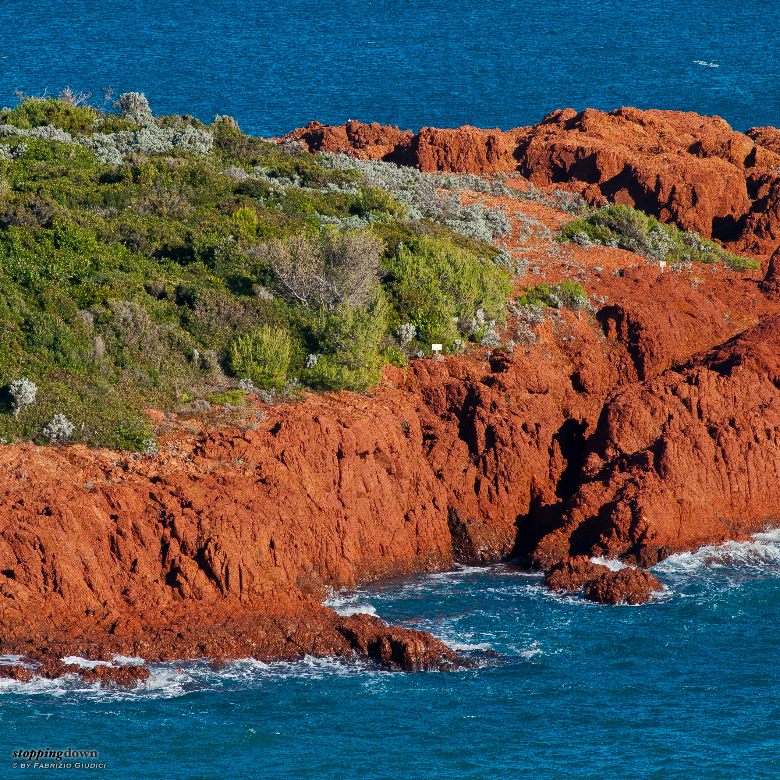
The Gordolasque River, Alpes-Maritimes, France. This scene depicts the quick transition between light and shadow at sunset. Exposure and post-processing have been chosen in order to still perceive details of the rocks in the shadow. Without a properly profiled monitor, shadow could look either completely black or reveal too much.
Standard gamuts
There is a number of standard gamuts defined by the industry. The NTSC gamut is a very wide one used in broadcasting (not to be confused with the NTSC scanline standard); ProPhoto RGB is another very wide gamut, once uncommon, but made popular since it's the one used by Adobe Lightroom; Adobe RGB is a very popular one with professionals, smaller than NTSC or ProPhoto; sRGB is an even smaller gamut for generic web rendering. Bruce Lindbloom has got a more comprehensive list, as well as an interactive 3D viewer (in L*a*b* coordinates). The gamut of many consumer computer displays is definitely small — things have started to change only recently, with “wide gamut” products (even in this case, quite a range of greens are left out). Clearly, the best things happen when you use a monitor and printer capable of the largest possible gamuts and process the image with the largest space available. While this in the past was the domain of expensive professional products, now things are changing fast.
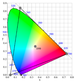
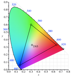
The ProPhoto RGB, the AdobeRGB and the sRGB gamuts shown in comparison to the CIE 1931 chromaticity diagram (courtesy of Wikimedia Commons).
Profiling in practice
The process for profiling a monitor needs a physical device, called colorimeter, which is a sensor laid over the screen capable to measure colours. After suggesting the proper settings for the monitor (that must not be changed), a specific software fills the monitor with a set of colour patches (usually a few hundreds) and measures them. With some mathematical computations, the software produces an ICC file which contains both the calibration and the characterization. There are pieces of software that offers profiling without a sensor, by relying instead on feedback from human observation, but don't trust them: they will inevitably lead to inaccurate results. If you repeat the profiling process for all the rendering devices you own, you will be able to see your photos in a way so that they match as much as possible (they will look identical in devices with the same gamut). Of course, if you publish your photos to the web, you must invite people to seriously consider calibration. If they don't, they won't see your work as they should, but at least they have been warned.

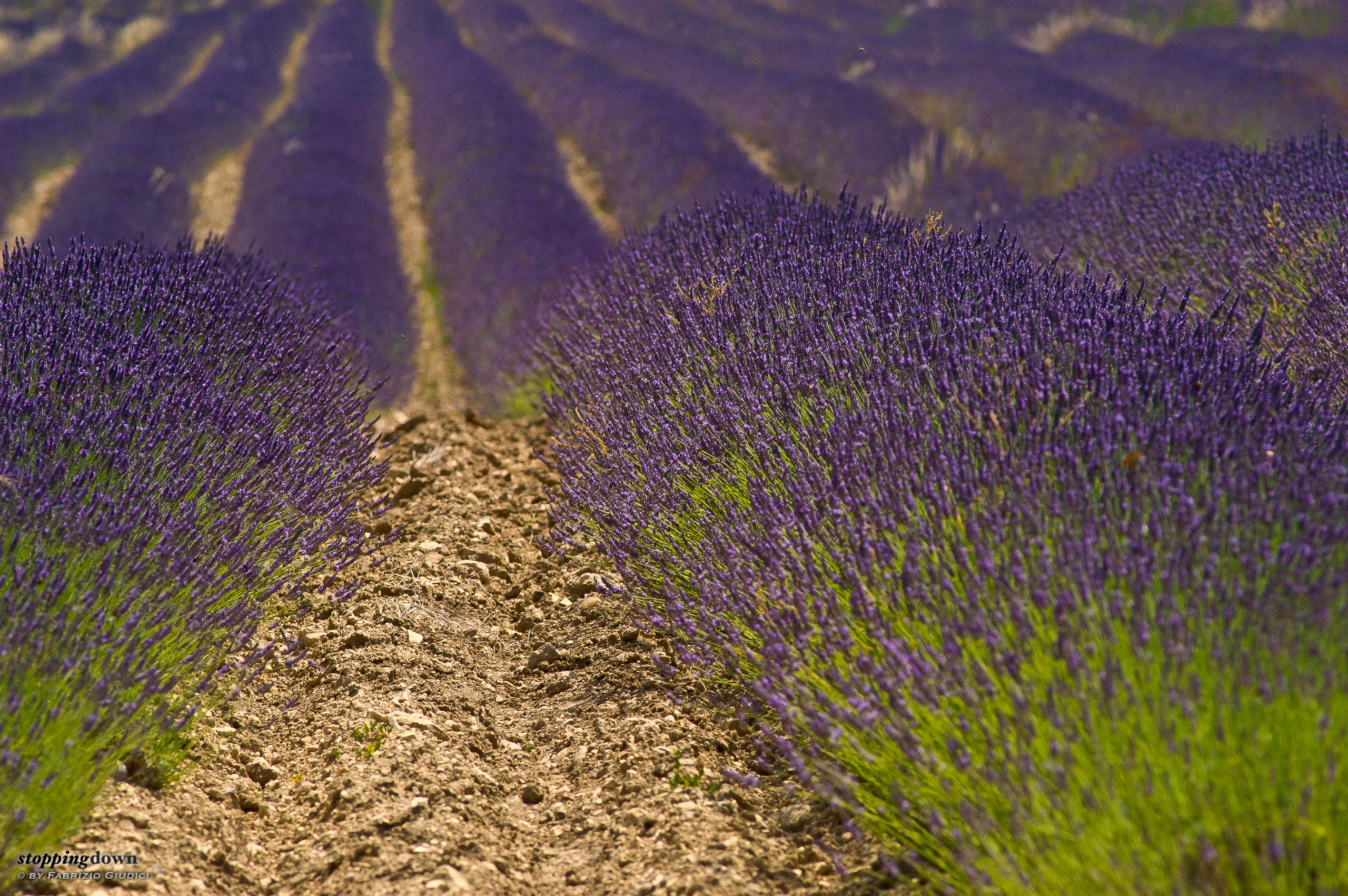
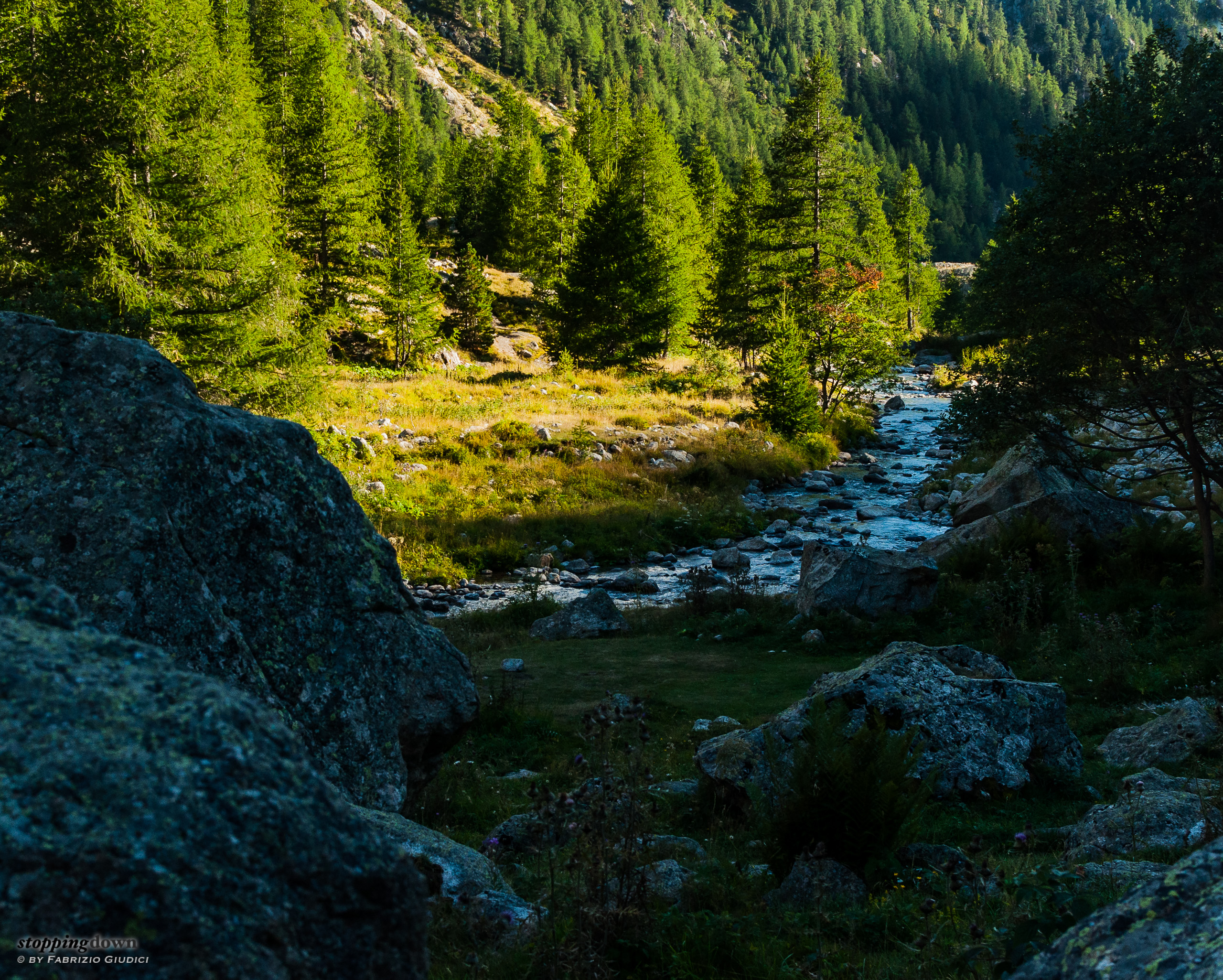
Lavender field at Senanque. In my experience lavender can be a critical subject for the correct reproduction of colours. Its violet tint can have or not a pinkish hue in function of the colour temperature. I needed a very long learning path to be able to properly calibrate both my laptop screen and the external monitor so this and similar photos are rendered in the same way. I'm sure most people looking at my lavender photos on the web with a not calibrated monitor see something quite different from the original.
The web is broken
There are two other problems. Unfortunately most of smartphones and tablets, though they are more and more used to render photos, lack any calibration software. But even the old plain web can be a problem, as most of the current popular desktop browsers can't properly manage colour profiles different than sRGB. Unfortunately the noble art of photography undergoes a sort of violence perpetrated by the consumer market ignorance. This means that in order to maximize the chances that your photos are properly viewed by other people, including those who calibrated their monitors, you must convert the published copy of your work to the sRGB colour space that, being so small, will probably destroy part of the subtle colour hues that your photos might have. You can alternatively publish a second set of photos with a broader space, such as AdobeRGB or ProPhoto RGB, to be enjoyed by people who not only have calibrated their display, but also know what software to use for the proper rendering. Harder job, but which delivers an enhanced viewing experience.
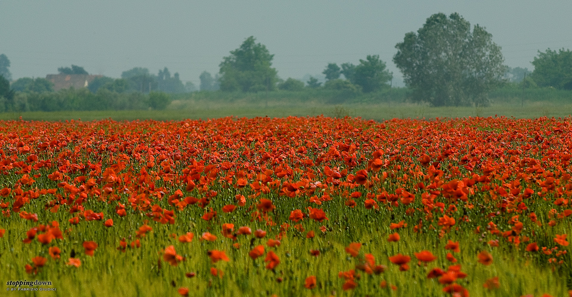
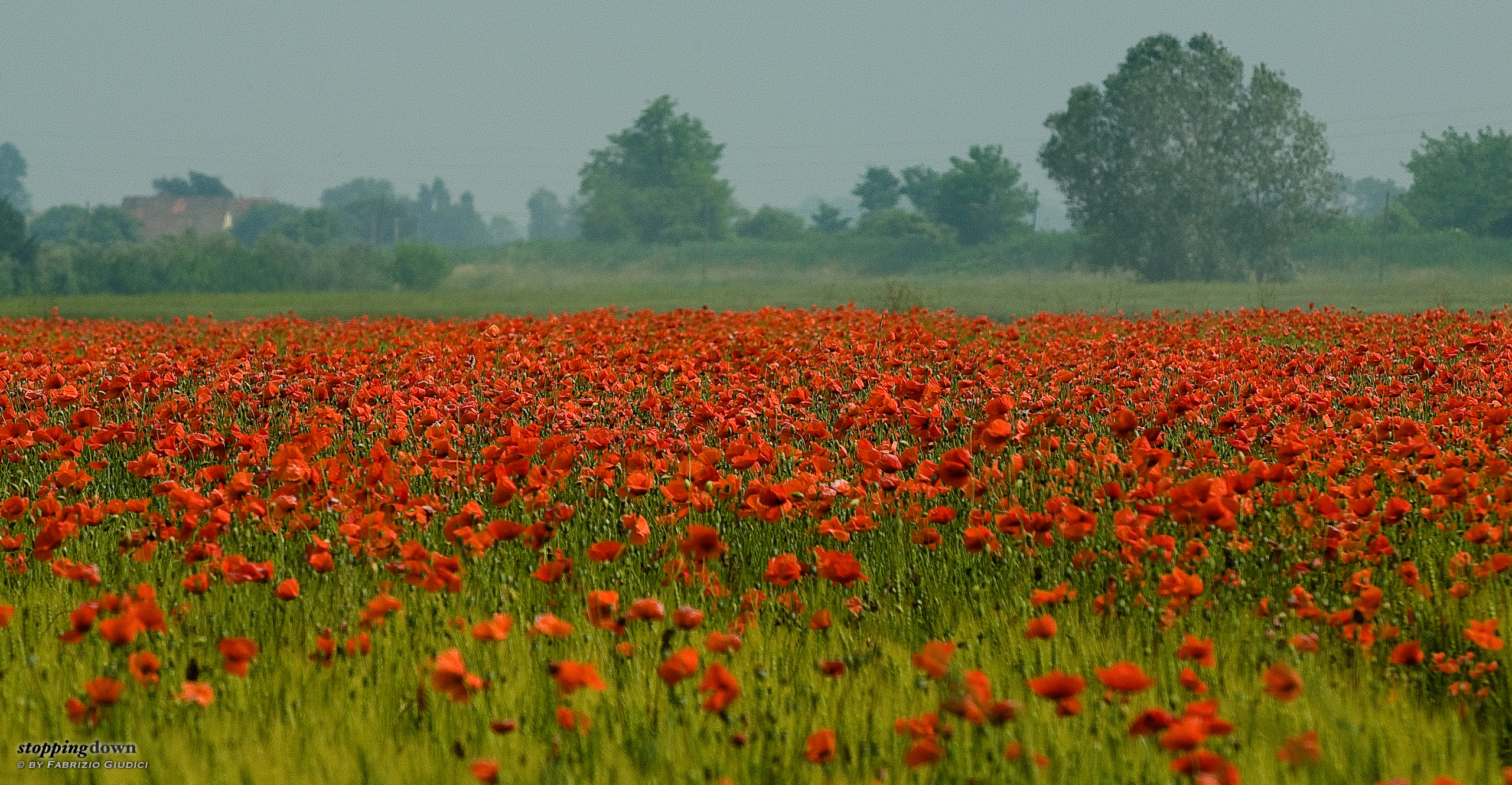
Poppies in a sunny day, Fiumicello. Poppies in direct sunlight pose some problems in exposure and post-processing that could lead to burned out reds. For publishing to the web, this photo has been converted to the sRGB space and reds have lost part of their saturation to accommodate into the small gamut. Their red is very different when the same image is looked at with Lightroom in ProPhoto RGB, or even printed.